 Vinyzu/cursory: Generate 100% human-realistic Mouse Trajectories with Timings.
https://github.com/Vinyzu/cursory
Generate 100% human-realistic Mouse Trajectories with Timings.
 Virtual Scrolling for Billions of Rows — Techniques from HighTable
https://rednegra.net/blog/20260212-virtual-scroll/
TL;DR: In this post, I present five techniques related to vertical scrolling used in <HighTable>, a React component that can display billions of rows in a table while keeping good performance and accessibility.
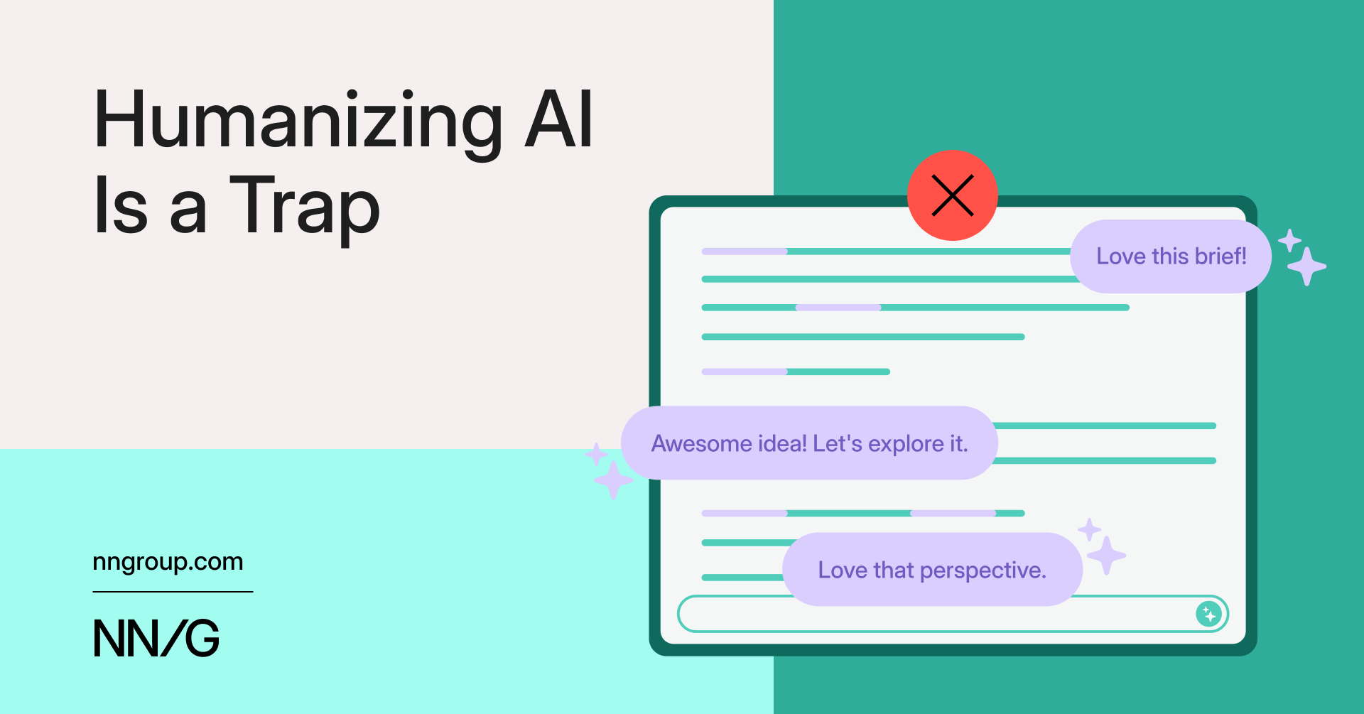
 Humanizing AI Is a Trap - NN/G
https://www.nngroup.com/articles/humanizing-ai/?ref=sidebar
Artificial intelligence can improve user experiences and solve problems without being human-like. Modern LLMs are naturally humanizing technologies because of their training, but organizations should recognize this trait and avoid emphasizing it through extra design choices. Even practitioners without control over base models can focus on system prompts that reduce sycophancy, evaluation criteria that prioritize accuracy over engagement, and interface decisions that emphasize usefulness over artificial friendship. Teams should create AI as practical tools, focusing on usability and utility rather than artificial personalities.

 Telepath: building a new kind of computer - unique hazards may exist
https://uniquehazards.com/2025/12/04/telepath-building-a-new-kind.html
That’s the mission of my new startup, Telepath. We’re building that metaphorical EV: the software stack for a new kind of computing experience, freed from decades of accrued assumptions, powered at its core by machine intelligence but employed in the service of individuals. We aren’t really an “AI company”, and we aren’t chasing AGI. We see AI as normal technology, but one that carries an unusual level of both promise and peril. Used wisely and responsibly, this technology has the potential to elevate our computers and unlock a revolution even greater and more exciting than the move from CLI to GUI forty years ago.

 Designers Have to Move from the Surface to the Substrate — Suff Syed
https://www.suffsyed.com/futurememo/designers-have-to-move-from-the-surface-to-the-substrate
We're still arguing about “does Figma Make augment creativity” while the actual decisions, the ones that will shape how billions of people relate to intelligence, are being made in rooms we're not invited to, using language we haven't learned, by people who will have to move mountains to help the designers of today understand these technical nuances. Which will inadvertently slow progress down. In a landscape that’s moving at blistering speed, that’s a make or break.
 Simon Højberg ❈ Principal Frontend Engineer
https://hojberg.xyz/
Essays, explorations, and expressions
 How to Undo Your iPhone's New Look After iOS 26
https://lifehacker.com/tech/how-to-undo-iphone-ios-26-liquid-glass
Called Reduce Transparency, this control has been around for years, and was originally intended as a way to add a solid background to any pre-Liquid Glass elements that already had transparent or blurred backgrounds, like the Passcode entry screen. Now, though, it turns out it also affects Liquid Glass as a whole.
 The Last Programmers || Xipu Li
https://www.xipu.li/posts/the-last-programmers
But here's what I think the guardians are missing: the world is changing faster than their gatekeeping can keep up with. The bar for "good enough" code keeps dropping while the bar for understanding users and building valuable products keeps rising. A slightly inefficient implementation that ships next week is often better than a perfectly optimized implementation that ships next month.

 Beyond Text-Only AI: On-Demand UI Generation for Better Conversational Experiences - fka.dev
https://blog.fka.dev/blog/2025-05-16-beyond-text-only-ai-on-demand-ui-generation-for-better-conversational-experiences/
Explore how AI-generated user interfaces can enhance human-AI interaction by dynamically creating the right interface components at the right time, addressing key limitations of text-only interactions.
 Chatbots are AI anti-patterns! | Jakob Pörschmann
https://hello-jp.net/building-beyond-the-buzz/chatbots-are-ai-antipatterns
Why did we fall in love with chat interfaces for human-ai interaction? Let us leave them behind once and for all.

 The Subtle Art of Designing Physical Controls for Cars
https://www.theturnsignalblog.com/the-subtle-art-of-designing-physical-control-for-cars/
In a previous article, I created a concept for in-car climate controls focusing on simple, physical controls. I've now found the time to turn this concept into reality through a rotary dial with dynamic haptic feedback. Along the way, I tested what makes dials feel intuitive, explored haptic design principles, and compared my approach to what carmakers are doing today.
 Tab panel using <details> with vertical tabs and web components
https://codepen.io/lmorchard/pen/eYqWmvV
Tab panel using <details> with selectable tab orientation (no JS)
https://codepen.io/lmorchard/pen/mdNmyvP
 Another 100 CSS loaders for your next project - DEV Community 👩💻👨💻
https://dev.to/afif/another-100-css-loaders-for-your-next-project-352l
Ready for the second set of loaders? Yes, it's again me with another collection of 100 CSS loaders. Now you have a total of 200 different loaders!
 User friendliness? User empowerment? How to make a choice?
http://static.lukew.com/alan_ng.pdf
When
doing user interface design, it is possible to make the interface to be
user friendly (less user control) or user empowered (more user control).
However, it seems that user friendliness and user empowerment are two
extremes and being against each other. Usually we can only make a
choice between them. But is it the best we can do?
 Why cards are the future of the web | Inside Intercom
http://insideintercom.io/why-cards-are-the-future-of-the-web
 Computer scrollbars: Why is Apple eradicating a linchpin of user interface design? - Slate Magazine
http://www.slate.com/articles/technology/technology/2011/11/computer_scrollbars_why_is_apple_eradicating_a_linchpin_of_user_interface_design_.html
I can understand the impulse here: Most scrollbars are kind of ugly. Even the skinny, rounded gray bar that Apple invented for the iPhone isn’t the prettiest interface element ever designed. But as unpleasant as they may be to look at, scrollbars serve a purpose on a busy screen: They tell you, at a glance, where you are in a list or a document. Because most modern scrollbars are proportional to the size of the document you’re looking at, they also give you a sense of how much lies off-screen—the smaller the scrollbar, the larger the document. And when you don’t see a scrollbar—or when the scrollbar is dimmed—this usually means there’s nothing outside the screen to look at.
 A Brief Rant on the Future of Interaction Design
http://worrydream.com/ABriefRantOnTheFutureOfInteractionDesign
Are we really going to accept an Interface Of The Future that is less expressive than a sandwich?
 FUI Fantasy User Interfaces | Mark Coleran Visual Designer
http://blog.coleran.com/category/portfolio/screendesign
"FUI Fantasy User Interfaces, Portfolio"
 Yahoo! OpenID: Now more powerful and easier to use (Yahoo! Developer Network Blog)
http://developer.yahoo.net/blog/archives/2009/09/yahoo_openid_hybrid.html
"We're happy to announce support for the OpenID OAuth Hybrid Protocol, which combines OpenID authentication (sign in) with OAuth authorization (access control) in a single interface. The Hybrid Protocol makes it easy for the hundreds of millions of Yahoo! users to sign into websites with a Yahoo! account, and to enable two-way data sharing of their Profile, Contacts, and Updates, without having to register a new site-specific account or share their Yahoo! password."
 Weekend coding: Add a character counter as the background of a textarea with JavaScript | CodeUtopia
http://codeutopia.net/blog/2009/08/01/weekend-coding-add-a-character-counter-as-the-background-of-a-textarea-with-javascript
"Have you ever filled a textarea on a page, which had a limit to how many characters you could type into it? ... How to effectively communicate how many characters you can type into a box, and have it look good. ... Add the number counter as the background of the textarea!"
 10 UI Design Patterns You Should Be Paying Attention To | How-To | Smashing Magazine
http://www.smashingmagazine.com/2009/06/23/10-ui-design-patterns-you-should-be-paying-attention-to
"design patterns are solutions to recurring problems. By extension, UI design patterns are solutions to common user interface problems. This article goes over 10 interesting UI design patterns that you can use in your own projects. In fact, you may already be using them now without knowing it."
 Poka-yoke - Wikipedia, the free encyclopedia
http://en.wikipedia.org/wiki/Poka-yoke
"Poka-yoke (ポカヨケ, Poka-yoke?) (IPA: [poka joke]) is a Japanese term that means "fail-safing", "Foolproof" or "mistake-proofing" — avoiding (yokeru) inadvertent errors (poka)) is a behavior-shaping constraint, or a method of preventing errors by putting limits on how an operation can be performed in order to force the correct completion of the operation."
10 Useful Techniques To Improve Your User Interface Designs | How-To | Smashing Magazine
http://www.smashingmagazine.com/2008/12/15/10-useful-techniques-to-improve-your-user-interface-designs
"1. Padded block links 2. Typesetting buttons 3. Using contrast to manage focus 4. Using color to manage attention 5. White space indicates relationships 6. Letter spacing 7. Auto-focus on input 8. Custom input focus 9. Hover controls 10. Verbs in labels"
 Human Computer Interaction in Science Fiction Movies
http://w5.cs.uni-sb.de/~butz/teaching/ie-ss03/papers/HCIinSF
"Science Fiction movies have been a source for speculation about the future of technology and human computer interaction. This paper presents a survey of different kinds of interaction designs in movies during the past decades and relates the techniques of the films to existing technologies and prototypes where possible. The interactions will be categorized with respect to their domain of real-life applications and also evaluated in regard to results of current research in human computer interaction."